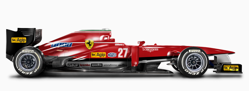
sorry guys, no matter how you do it, this livery of ferrari just has zero potential.
to be honest, i think the ferrari actually is a little bit ugly. i dunno what it is, but it looks just, 'misformed'.
the marussia-like black part at the rear makes it worse.the white line between the black and the red isn't doing
it any good, either.
and yes, it's very cluttered and busy with the logo's.
they should just take an example out of this:


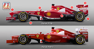
all black rear wing endplates with a yellow shell top,
all black front wing endplates,
no white lines nowhere