Renault R27

A place to discuss the characteristics of the cars in Formula One, both current as well as historical. Laptimes, driver worshipping and team chatter do not belong here.
Post Reply
User avatar
GTO
0
Joined: 09 Jun 2005, 01:16
Location: Oil Country

Post

When I first saw these first few pics. I thought the color scheme was fantastic.
http://images.f1racing.net/large/67434.jpg
http://images.f1racing.net/large/67435.jpg
http://images.f1racing.net/large/67430.jpg
Mainly White & Renault yellow, trimmed with ING orange & dark blue. Tastefully colorful.

As I flipped through more pics of the launch, I realized (to my horror) that they had over done it with the orange paint. I'm by no means a marketing guru with any graphic design training, but, there is no flow or coherence of paint colors from the front of the car to the back.
http://images.f1racing.net/large/67422.jpg
http://images.f1racing.net/large/67428.jpg
http://images.f1racing.net/large/67396.jpg

Idividual areas look good when seen alone, but the overall view of the car looks disjointed & hurried.

In addition, the paint scheme does not in any way flatter or highlight the beautiful aero shape of the body. What a waste!

I think the team has found a way of cutting costs. They have obviously not contracted high priced marketing & design consultant to develop an appealing "look". Instead staff took blank car & driver suit dwgs. home & given 4 team color crayons to their 5 yr. old kids & let them color their hearts out. Then gave them all to Flavio & let him chose the most gaudy one of the lot while wearing his blue tinted spectacles.
http://images.f1racing.net/large/67421.jpg

sebbe
0
Joined: 17 May 2006, 19:27
Location: Argentina

Post

I think Renault's new livery is one of the most beautiful.
Of course we need time to accept it, after all we're not used to see this amount of change.
Even McLaren's silver chrome livery is conservative compared to this.

I agree with GTO, the aero work done in the body is hard to notice, but let's don't forget that the McLaren paint sparkles in the studio photos and on the track it is almost pale gray due to the reflexion of the track itself.
"I've already altered the deal, pray I don't alter it any further" -Darth Vader to Lando Calrissian. The Empire Strikes Back.
"Progress is not always made by reasonable men." (McLaren Racing).
"We have optimised the lateral optical interface of the building." (Translation: "My factory has a lot of windows.") Ron Dennis.-

User avatar
m3_lover
0
Joined: 26 Jan 2006, 07:29
Location: St.Catharines, Ontario, Canada

Post

sebbe wrote:I think Renault's new livery is one of the most beautiful.
Of course we need time to accept it, after all we're not used to see this amount of change.
Even McLaren's silver chrome livery is conservative compared to this.

I agree with GTO, the aero work done in the body is hard to notice, but let's don't forget that the McLaren paint sparkles in the studio photos and on the track it is almost pale gray due to the reflexion of the track itself.
I thought the mclaren car would have some silver/chrome on it because in the testing pics you can see the sun hitting the paint and making it hard to see sometimes
Simon: Nils? You can close in now. Nils?
John McClane: [on the guard's phone] Attention! Attention! Nils is dead! I repeat, Nils is dead, ----head. So's his pal, and those four guys from the East German All-Stars, your boys at the bank? They're gonna be a little late.
Simon: [on the phone] John... in the back of the truck you're driving, there's $13 billon dollars worth in gold bullion. I wonder would a deal be out of the question?
John McClane: [on the phone] Yeah, I got a deal for you. Come out from that rock you're hiding under, and I'll drive this truck up your ass.

mx_tifoso
0
Joined: 30 Nov 2006, 05:01
Location: North America
Contact:

Post

I hope we dont see those colors on the podium too often 8)
As they will mess up the great color scheme of red on the 1st and 2nd steps


Scuderia Ferrari 2007 WCC
Forum guide: read before posting

"You do it, then it's done." - Kimi Räikkönen

Por las buenas soy amigo, por las malas soy campeón.

User avatar
fwa2500
0
Joined: 10 Apr 2005, 20:43

Post

wow those are ugly colours........the testing livery i thought looked great, but this flat out sucks....makes even the toyota livery look sophisticated......not to mention how bad the overalls are.....

what i'd like even more than the test livery is the one i designed based on the old colours....
http://www.deviantart.com/deviation/41610399/


the only thing i like about it is the new car design its self.....those mirrors are fantastic

benjabulle
0
Joined: 26 Aug 2004, 21:53
Contact:

Post

I just added close up photos of the R27 :
http://www.gurneyflap.com/formula1renault.html

djones
20
Joined: 17 Mar 2005, 15:01

Post

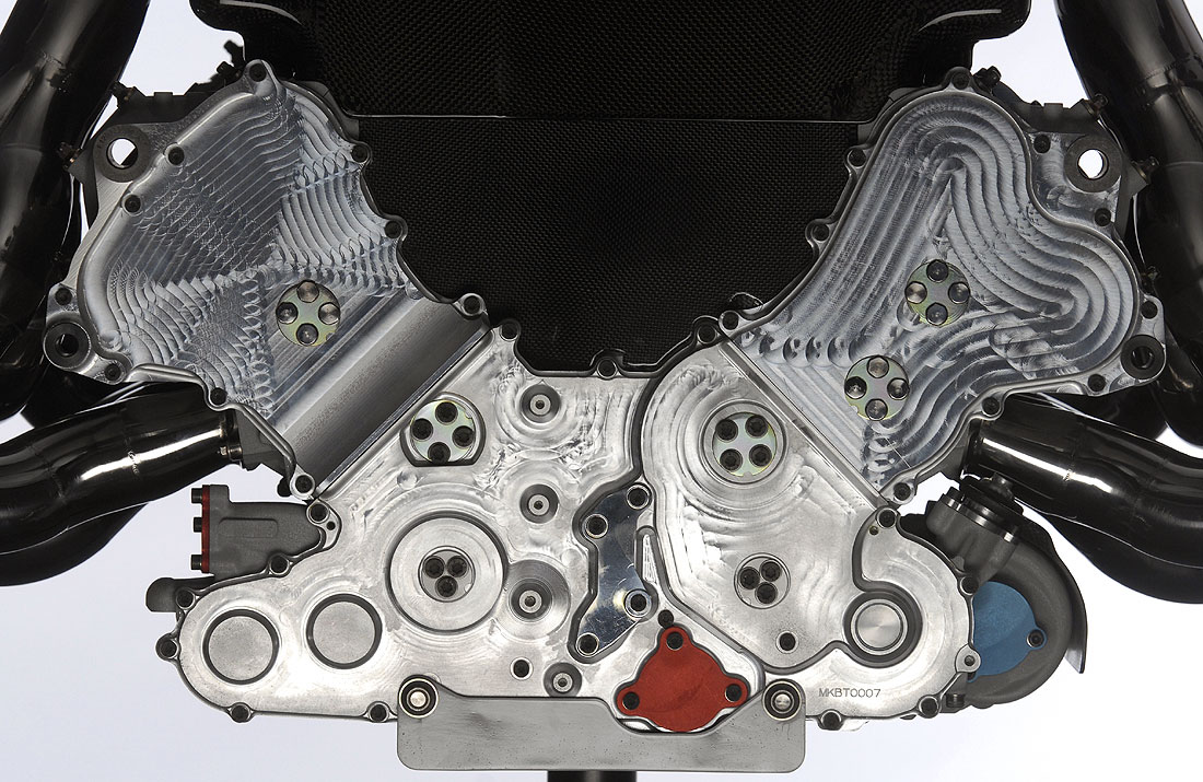
How come the end of the engine has bizzare machine marks?

Image

zac510
22
Joined: 24 Jan 2006, 12:58

Post

djones wrote:How come the end of the engine has bizzare machine marks?
'cos it has been machined in that pattern by a tool!

djones
20
Joined: 17 Mar 2005, 15:01

Post

What's the advantage of that? I have never seen a surface like that before.

User avatar
Principessa
0
Joined: 12 Aug 2005, 14:36
Location: Zottegem Belgium
Contact:

Post

I wonder why everybody keeps posting pictures of other sites here if all the good and important pictures are online here in our gallery:
http://www.f1technical.net/gallery/v/Re ... 27/Launch/
Maybe some of you haven't found our gallery yet :?

As I said before? I like the livery as well...I already put one of the pictures as wallpaper! Of course it's completly different of what we're used too, but that's normal if you have a new sponsor. The Honda livery (when it's presented in February -> Special event) will be totally different too!
I like it and the car looks bloody fast!

User avatar
f1.redbaron
0
Joined: 31 Jul 2005, 23:29

Post

djones wrote:How come the end of the engine has bizzare machine marks?
removing any unnecessary weight without compromising the structural integrity, perhaps?

BreezyRacer
2
Joined: 04 Nov 2006, 00:31

Post

Cooling fins!

i70q7m7ghw
49
Joined: 12 Mar 2006, 00:27
Location: ...

Post

Principessa wrote:I wonder why everybody keeps posting pictures of other sites here if all the good and important pictures are online here in our gallery:
http://www.f1technical.net/gallery/v/Re ... 27/Launch/
Maybe some of you haven't found our gallery yet :?

As I said before? I like the livery as well...I already put one of the pictures as wallpaper! Of course it's completly different of what we're used too, but that's normal if you have a new sponsor. The Honda livery (when it's presented in February -> Special event) will be totally different too!
I like it and the car looks bloody fast!
No I like new different things... this isn't new, it's just the old livery with a few other bits added over the top, its horrible... I will never like this...

User avatar
Ray
2
Joined: 22 Nov 2006, 06:33
Location: Atlanta

Post

Can't be any worse than Kimis new helmet! :lol:

User avatar
wazojugs
1
Joined: 31 Mar 2006, 18:53
Location: UK

Post

djones wrote:How come the end of the engine has bizzare machine marks?

[img:1100:715]http://www.gurneyflap.com/Resources/rs27C.jpg[/img]
that is the pattern made by the tooling from the multi access CNC machine.

the drawing is made using CAD and then post processed to the CNC machine where the milling and cutting is programmed for that part from a billet.

what you are seing is basically the raw part from the billet, i am assuming that some honing will be done to the part to get it down to a surgface of a few microns

Post Reply