Racing number legibility

Post here all non technical related topics about Formula One. This includes race results, discussions, testing analysis etc. TV coverage and other personal questions should be in Off topic chat.
User avatar
JordanMugen
82
Joined: 17 Oct 2018, 13:36

Racing number legibility

Post

Do folks think FIA should make a clarification about the legibility of racing numbers on the cars? :)

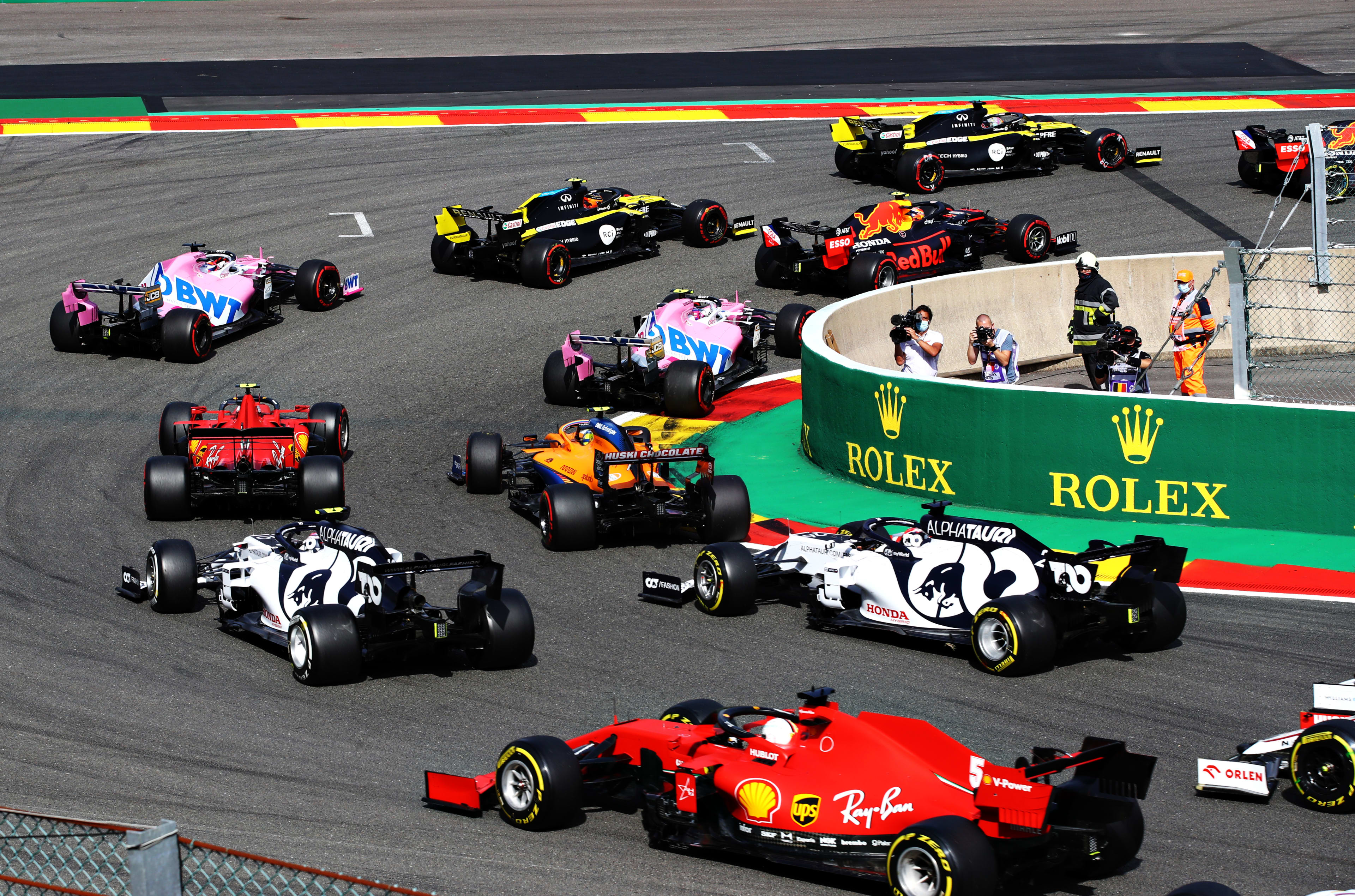
For example Ferrari have black numbers on a red background on their 2022 livery, and worse, some cars have stylised numbers that are almost illegible. It shouldn't take detective work to read the race number, they are supposed to be highly visible at speed for the purposes of (back-up) manual race timing (if required) after all! :)

Something along the lines of "Hindu-Arabic numerals must be used with sufficient contrast and legibility to be correctly transferred to text by [X] OCR software, when photographed at X mm distance using a Y mm lens with f/3.5 on a Nikon XYZ in a shaded pit garage" perhaps? :)

wogx wrote:
19 Feb 2022, 01:40
And that's just an 8:
Image
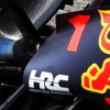
For reference, Google Lens refuses to recognise that number as text at all let alone as a 63! [Google Lens has no trouble identifying the "Right F" which is actually legible...]

I'm not sure I would want to go far as saying "you must have white or black squares of (say) 200x200mm with respectively black or white Helvetica numerals of no less than 150mm height" (as you might find in the regulations of say Formula Vee or Formula Ford), they can still have creativity and styling choices but with the rules as they are F1 livery designers really seem to be taking the mickey!

User avatar
jumpingfish
53
Joined: 26 Jan 2019, 16:19
Location: Ru

Re: Racing number legibility

Post

Absolutely agree, the FIA needs to clarify this. In addition to the size, font, height of the number, a strict position and background for the number must also be specified so that the contrast is maximum (black text on white for example). I wrote earlier that Ferrari had the best option in 2018, from any angle the number was clearly visible even in poor quality video (360p). Of course, if the broadcasts were in 4k60fps, with a perfect picture, then no problem, but in reality the quality is worse and hard to see.

Image

User avatar
JordanMugen
82
Joined: 17 Oct 2018, 13:36

Re: Racing number legibility

Post

jumpingfish wrote:
19 Feb 2022, 09:27
Absolutely agree, the FIA needs to clarify this. In addition to the size, font, height of the number, a strict position and background for the number must also be specified so that the contrast is maximum (black text on white for example). I wrote earlier that Ferrari had the best option in 2018, from any angle the number was clearly visible even in poor quality video (360p). Of course, if the broadcasts were in 4k60fps, with a perfect picture, then no problem, but in reality the quality is worse and hard to see.

https://i2.wp.com/www.vapoteurs.net/wp- ... 2018-9.jpg
I believe that was a response to the 2016 requirements, should F1 go back to those? :)
Charlie Whiting wrote: We require each car number to be clearly visible from the front of the car (Article 9.2). We feel that to be clearly visible the numbers should be no less than 230mm high, have a minimum stroke thickness of 40mm and be of a clearly contrasting colour to their background.

A report will be made to the stewards concerning any car that does not comply with the above minimum requirements.
https://www.autosport.com/f1/news/fia-r ... 0/5016420/

The FIA, perhaps unwisely, seem to have dropped these requirements. :?: :wtf:

User avatar
Sieper
73
Joined: 14 Mar 2017, 15:19

Re: Racing number legibility

Post

Please, please, please, no led signs. For the love of Formula.

I’m looking at the T-cam when I need quick identification.

User avatar
jumpingfish
53
Joined: 26 Jan 2019, 16:19
Location: Ru

Re: Racing number legibility

Post

JordanMugen wrote:
19 Feb 2022, 10:23
jumpingfish wrote:
19 Feb 2022, 09:27
Absolutely agree, the FIA needs to clarify this. In addition to the size, font, height of the number, a strict position and background for the number must also be specified so that the contrast is maximum (black text on white for example). I wrote earlier that Ferrari had the best option in 2018, from any angle the number was clearly visible even in poor quality video (360p). Of course, if the broadcasts were in 4k60fps, with a perfect picture, then no problem, but in reality the quality is worse and hard to see.

https://i2.wp.com/www.vapoteurs.net/wp- ... 2018-9.jpg
I believe that was a response to the 2016 requirements, should F1 go back to those? :)
Charlie Whiting wrote: We require each car number to be clearly visible from the front of the car (Article 9.2). We feel that to be clearly visible the numbers should be no less than 230mm high, have a minimum stroke thickness of 40mm and be of a clearly contrasting colour to their background.

A report will be made to the stewards concerning any car that does not comply with the above minimum requirements.
https://www.autosport.com/f1/news/fia-r ... 0/5016420/

The FIA, perhaps unwisely, seem to have dropped these requirements. :?: :wtf:
Sure they should :)
Sieper wrote:
19 Feb 2022, 10:48
Please, please, please, no led signs. For the love of Formula.

I’m looking at the T-cam when I need quick identification.
But not all people remember which driver is with yellow T-cam, and who is with black one :) I can name only 4-6 drivers which I know what cameras do they have. And no need LED, just black numbers on white background :)

User avatar
NathanOlder
48
Joined: 02 Mar 2012, 10:05
Location: Kent

Re: Racing number legibility

Post

Sieper wrote:
19 Feb 2022, 10:48
Please, please, please, no led signs. For the love of Formula.

I’m looking at the T-cam when I need quick identification.
Yeah T Cam is absolutely all you need. If anything they could bring back the red T Cams as well. The noses are getting smaller, so the numbers will get smaller if you want them visible from the front.
Also when cars are in a group, the numbers can be useless where as the T Cam is still usually visib.

Image


Image
GoLandoGo
Lewis v2.0
King George has arrived.

New found love for GT racing with Assetto Corsa Competizione on PS5 & PC

User avatar
Stu
Moderator
Joined: 02 Nov 2019, 10:05
Location: Norfolk, UK

Re: Racing number legibility

Post

Numbers are easier to read on a still shot (one big benefit of stills over video.
Have a look at some moving footage of last years cars. Not picking on them, but the Mercedes had awful numbering (just a coloured outline) that made it practically impossible to read on a moving image. Mentioned in another thread yesterday, but try watching footage when both Mercedes are not in the same frame (not hard- sorry VB fans!!) and rapidly identify which one isn’t ‘car#6’….
Perspective - Understanding that sometimes the truths we cling to depend greatly on our own point of view.

michl420
19
Joined: 18 Apr 2010, 17:08
Location: Austria

Re: Racing number legibility

Post

The best thing is a T-cam in different colors. To think this further even better would be a red and yellow HALO. In old days driver have different Helmet colors, but now the colors are relativ even and they sit deep in the car. But I also think the numbers should be better to read. NO LED!!!

User avatar
Big Tea
99
Joined: 24 Dec 2017, 20:57

Re: Racing number legibility

Post

michl420 wrote:
20 Feb 2022, 11:57
The best thing is a T-cam in different colors. To think this further even better would be a red and yellow HALO. In old days driver have different Helmet colors, but now the colors are relativ even and they sit deep in the car. But I also think the numbers should be better to read. NO LED!!!
A yellow 'patch' on the halo would be an additional aid too. Viable from outside and onboard.
When arguing with a fool, be sure the other person is not doing the same thing.

User avatar
jjn9128
769
Joined: 02 May 2017, 23:53

Re: Racing number legibility

Post

michl420 wrote:
20 Feb 2022, 11:57
The best thing is a T-cam in different colors. To think this further even better would be a red and yellow HALO. In old days driver have different Helmet colors, but now the colors are relativ even and they sit deep in the car. But I also think the numbers should be better to read. NO LED!!!
Thing is, my eyes (and I'm sure others) don't go to the T-cam. Oddly I found the Williams red triangles on the wing pylons and the Benneton red nose tip easier to spot - though in those days driver's helmets were easier to distinguish too.
#aerogandalf
"There is one big friend. It is downforce. And once you have this it’s a big mate and it’s helping a lot." Robert Kubica

User avatar
JordanMugen
82
Joined: 17 Oct 2018, 13:36

Re: Racing number legibility

Post

jjn9128 wrote:
20 Feb 2022, 13:41
Thing is, my eyes (and I'm sure others) don't go to the T-cam.
I don't look at the T-cams either, I couldn't tell you which driver had the yellow one and which had the plain black one.

I rather liked the nice big numbers that complied with Whiting's directive. I always look for the number or the helmet colour. :)

Image

NathanOlder wrote:
20 Feb 2022, 10:59
T Cam is absolutely all you need.
Number 77 = Bottas, you can't miss it - it's easy! I don't understand how looking for the (much smaller) yellow stripe on the T-cam is supposed to be easier? :?:

"...numbers should be no less than 230mm high, have a minimum stroke thickness of 40mm and be of a clearly contrasting colour to their background. A report will be made to the stewards concerning any car that does not comply with the above minimum requirements." It's so easy to have good numbers. :)

Now that there are driver numbers which don't change, it is much easier to remember the numbers than T-cam colours.
Last edited by JordanMugen on 20 Feb 2022, 13:55, edited 5 times in total.

User avatar
Big Tea
99
Joined: 24 Dec 2017, 20:57

Re: Racing number legibility

Post

jjn9128 wrote:
20 Feb 2022, 13:41
michl420 wrote:
20 Feb 2022, 11:57
The best thing is a T-cam in different colors. To think this further even better would be a red and yellow HALO. In old days driver have different Helmet colors, but now the colors are relativ even and they sit deep in the car. But I also think the numbers should be better to read. NO LED!!!
Thing is, my eyes (and I'm sure others) don't go to the T-cam. Oddly I found the Williams red triangles on the wing pylons and the Benneton red nose tip easier to spot - though in those days driver's helmets were easier to distinguish too.
My go to point was always the helmet, but these days they see to either all blend into the same 'blob' or be more influenced by light/shadow angle. Bring back the plain 3 colour hat I say ( but my grandkids say I'm a grouch about things like that :evil: )
When arguing with a fool, be sure the other person is not doing the same thing.

michl420
19
Joined: 18 Apr 2010, 17:08
Location: Austria

Re: Racing number legibility

Post

jjn9128 wrote:
20 Feb 2022, 13:41
michl420 wrote:
20 Feb 2022, 11:57
The best thing is a T-cam in different colors. To think this further even better would be a red and yellow HALO. In old days driver have different Helmet colors, but now the colors are relativ even and they sit deep in the car. But I also think the numbers should be better to read. NO LED!!!
Thing is, my eyes (and I'm sure others) don't go to the T-cam. Oddly I found the Williams red triangles on the wing pylons and the Benneton red nose tip easier to spot - though in those days driver's helmets were easier to distinguish too.
You are right. In 1999 Mclaren run front wings with one red and one black sponsor logo and it was a really good indicator.

User avatar
Cuky
65
Joined: 07 Dec 2011, 19:41
Location: Rab, Croatia

Re: Racing number legibility

Post

michl420 wrote:
20 Feb 2022, 11:57
The best thing is a T-cam in different colors. To think this further even better would be a red and yellow HALO. In old days driver have different Helmet colors, but now the colors are relativ even and they sit deep in the car. But I also think the numbers should be better to read. NO LED!!!
Or at least differently colored mirrors, like Sauber used to have in late 90s where driver 1 would have red mirrors and driver 2 would have yellow. Here a picture from Melbourne 1998, that year they also painted the headrest in the same color as mirrors
Image

Or even doing something like a yellow detail on driver 2's front and rear wings would suffice (like how Ferrari used to do in late 80s and early 90s).

Though, FIA should leave teams some freedom with how they put numbers on their cars (colors, fonts etc.) they should really prescribe some basics, like size, separation of different digits, use of clearly contrasting colors... and if teams don't behave then do what football leagues started doing after teams got design happy with fonts for player's numbers and names... they standardized them for the whole league and teams are only allowed to customize it's colors and add team crests.

User avatar
NathanOlder
48
Joined: 02 Mar 2012, 10:05
Location: Kent

Re: Racing number legibility

Post

JordanMugen wrote:
20 Feb 2022, 13:45

NathanOlder wrote:
20 Feb 2022, 10:59
T Cam is absolutely all you need.
Number 77 = Bottas, you can't miss it - it's easy! I don't understand how looking for the (much smaller) yellow stripe on the T-cam is supposed to be easier? :?:

"...numbers should be no less than 230mm high, have a minimum stroke thickness of 40mm and be of a clearly contrasting colour to their background. A report will be made to the stewards concerning any car that does not comply with the above minimum requirements." It's so easy to have good numbers. :)

Now that there are driver numbers which don't change, it is much easier to remember the numbers than T-cam colours.
I agree numbers would be the way to go IF you had the right place to put them at the size you want. Noses are narrower and narrower , so the numbers on them will get smaller and smaller.

the side on shots we dont get as much as the front on shots as a lot of cameras are at coners watching the cars come towards them. And when the cars are coming towards the camera, the numbers aren't all that uselful.

From this shot, I can tell who is tucked up behind Lewis, no number placement will ever help with that unless they are big numbers on the rear wing.

Image

Thinking about it, maybe the rear wing is the way to go, with a big plain panel and a standard font with the drivers name. Similar to how Mclaren used to do it with the ban on tobacco advertising but with no logo and just a standard font.

Image
GoLandoGo
Lewis v2.0
King George has arrived.

New found love for GT racing with Assetto Corsa Competizione on PS5 & PC

Post Reply